Bowlsome Smoothie KioskA growing smoothie brand that needed to improve their customer experience through a self-service kiosk, allowing their customers to customize and order smoothie bowls without waiting for counter service.
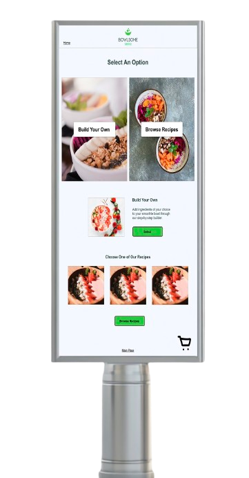
Overview
Bowlsome Smoothie is a growing smoothie brand that wanted to improve their customer experience through a self-service kiosk, allowing their customers to customize and order smoothie bowls without waiting for counter service.
Areas that needed addressed included navigation, iconography, larger text size and minimum interactions for accessibility, incorporating additional colors into the company’s color palette with neutral and semantic colors, creation of design components and form fields.
My Role
Assess the client brief provided from the company, create design systems for low fidelity and high fidelity wireframes, complete user testing and user research, and create high fidelity prototypes.
Tools: Adobe XD
Focus: UX Research • UI Design • Design System • Accessibility • Prototyping • Usability Testing
01 – Client Brief & User Research
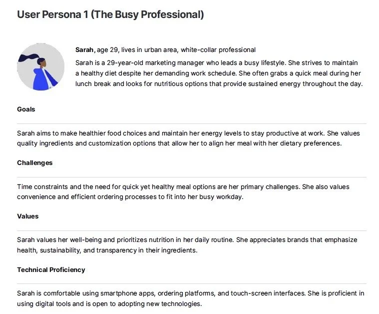
User Persona
I began by reviewing the Bowlsome Smoothie client brief, which included information about the company’s goals, target audience, market research, and existing brand colors.
The research emphasized a convenience-driven experience, allowing customers to either build a smoothie bowl from scratch or quickly select from pre-designed recipes.
Accessibility was also an important consideration, including large, readable text, sufficient color contrast, minimal interacts, and an interface that could be comfortable accessed by users with different needs.
02 – Low-Fidelity Wireframes
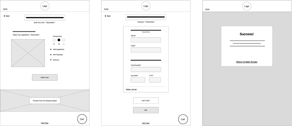
Low Fidelity Wireframes
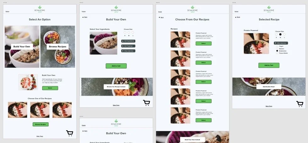
I created low-fidelity wireframes based on the client requirements and the kiosk’s 17″ x 24″ dimensions.
The initial layouts focused on establishing a simple navigation structure and efficient ordering flow before introducing visual styling. I explored ways for users to quickly select a pre-designed recipe or customize their own smoothie bowl.
03 – Design System
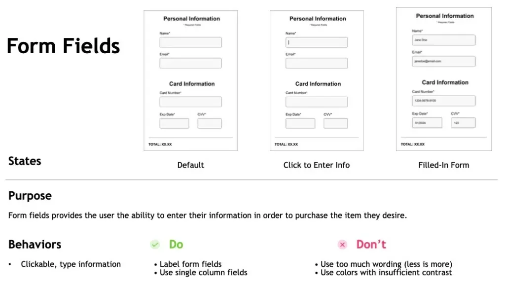
Design System Form Fields
Because Bowlsome Smoothie was still developing its visual identity, I created a design system to establish consistent UI patterns throughout the kiosk experience.
The system included typography, color, CTA buttons, button states, toggles, and form fields, providing the client with a foundation for maintaining consistency across the interface.
04 – High-Fidelity Design & Prototype
High Fidelity Wireframes
After the low-fidelity designs and design system were established, I developed the high-fidelity kiosk interface using the company’s visual identity and project requirements.
The completed screens were connected into an interactive prototype to simulate the ordering experience and prepare the design for usability testing.
05 – Usability Testing & Iteration
User Testing Script Tasks
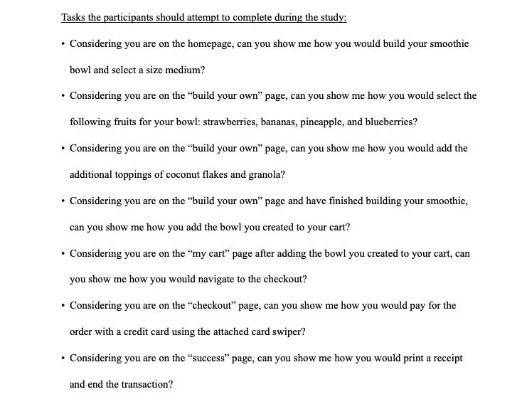
I conducted usability testing with participants using the high-fidelity prototype to evaluate navigation, interactions, and the overall ordering flow.
Testing showed that users were generally able to navigate the experience and identify the next step. However, both participants noted that the dropdown arrows were not sufficiently interactive or obvious.
Based on this feedback, I expanded the clickable areas and interaction cues to make the controls easier to understand and use, reducing potential confusion during the ordering process.
06 – Final Design
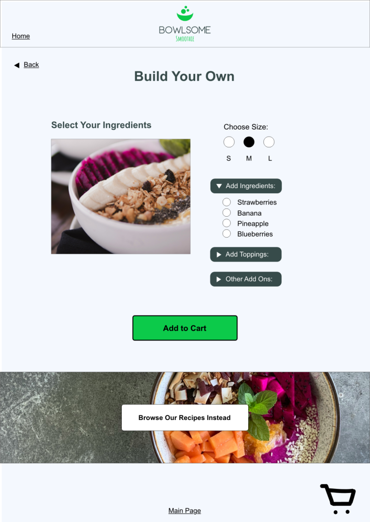
The final kiosk experience incorporated the findings from usability testing while maintaining the established design system and brand identity.
The result was a streamlined ordering experience that allows customers to browse recipes, customize their smoothie bowls, and move through the ordering process with minimal friction.
Key Takeaways
This project reinforced the importance of designing for a wide range of users and considering accessibility from the beginning of the design process.
Working with an evolving brand identity also gave me the opportunity to develop a design system that created consistency across the experience. Most importantly, usability testing showed me how easily small interaction details can affect a user’s ability to navigate an interface.
The project strengthened my ability to translate research and client requirements into a functional interface, test those decisions with users, and refine the experience based on real feedback.