Call Light AppA mobile and responsive app concept intended to improve communication between residents and staff while providing residents with greater clarity, accessibility, and control over their care experience.
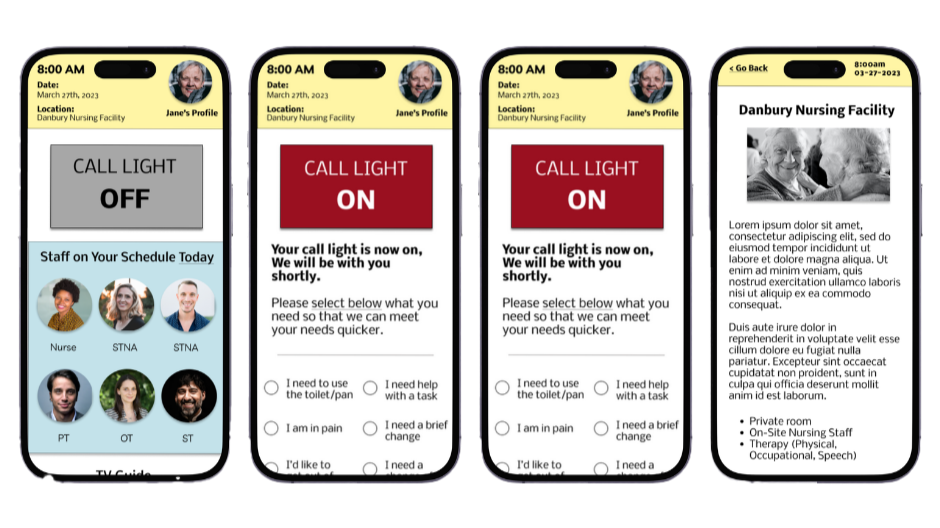
Overview
While working as an Occupational Therapy Assistant in a nursing home, I noticed recurring challenges with communication between residents and nursing staff. Residents often experienced confusion around their care, difficulty identifying their caregivers, and limited ways to communicate their needs beyond the traditional call-light system.
I designed Call Light, a mobile and responsive app concept intended to improve communication between residents and staff while providing residents with greater clarity, accessibility, and control over their care experience.
My Role
I completed the project from concept all the way through to high-fidelity prototype including user research, persona development, ideation, wireframing, user testing, affinity mapping, prototyping, and responsive design.
Role: UX Research • UX/UI Design • Prototyping • Usability Testing
Tools: Figma
Project: Google UX Design Certificate 2023
01 – User Research & Personas
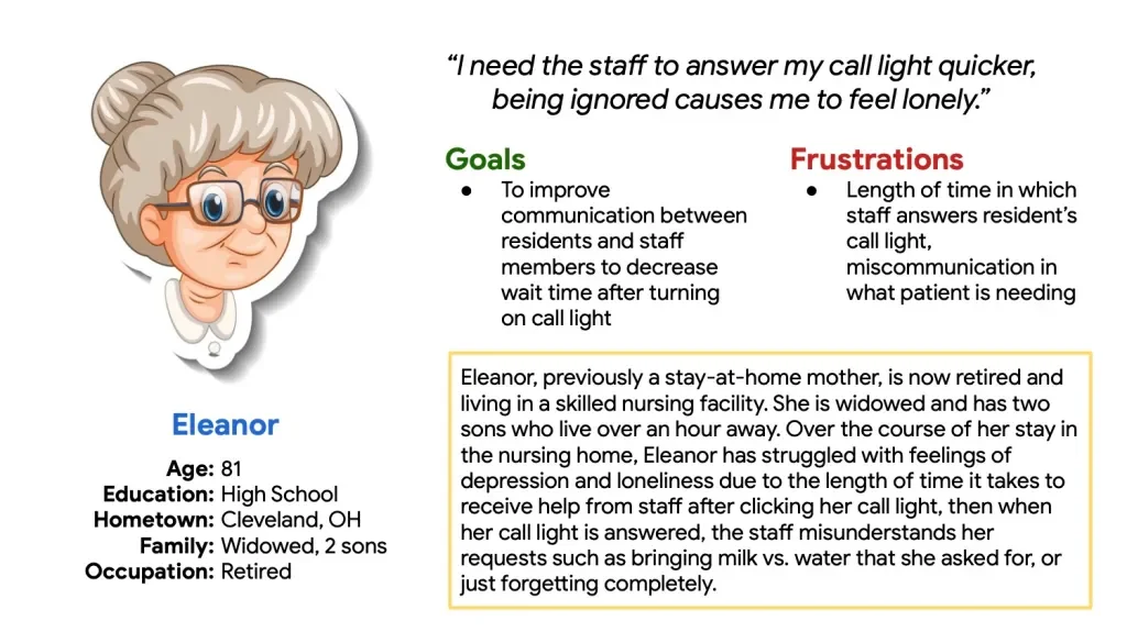
User Persona
I developed user personas to better understand the goals, frustrations, and needs of potential residents using the Call Light system. My previous experience in a nursing home gave me firsthand insight into the communication challenges surrounding call light systems. I spoke with several residents and employees about their experiences, frustrations, and needs to better understand the problem from different perspectives.
These conversations helped me identify recurring challenges with communication, responsiveness, and knowing what to expect after a call was placed. These insights helped shape the direction of the app and the features I explored throughout the project.
02 – Sketches & Ideation
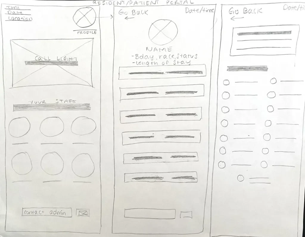
Hand Sketched Wireframes
I began by sketching potential layouts, features, and navigation paths to explore different ways residents and staff could interact with the system. These early sketches helped me quickly evaluate ideas before moving into digital wireframes.
03 – Low-Fidelity Wireframes
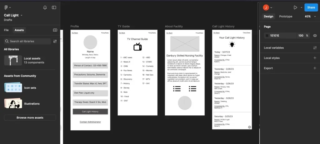
Low Fidelity Wireframes
I translated the initial sketches into low-fidelity wireframes in Figma, focusing on structure, navigation, and functionality rather than visual styling. These wireframes became the foundation for the initial prototype and usability testing.
04 – Usability Testing & Affinity Mapping
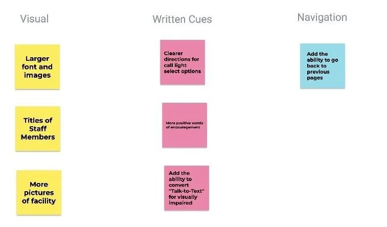
Affinity Diagram
I tested the initial prototype with users to identify areas of confusion, usability issues, and opportunities for improvement. I also organized the feedback through affinity mapping to identify recurring themes and prioritize changes to the experience. Testing revealed users had difficulties with understanding the directions for the call light “select options”, so I revised this area to make the available actions clearer.
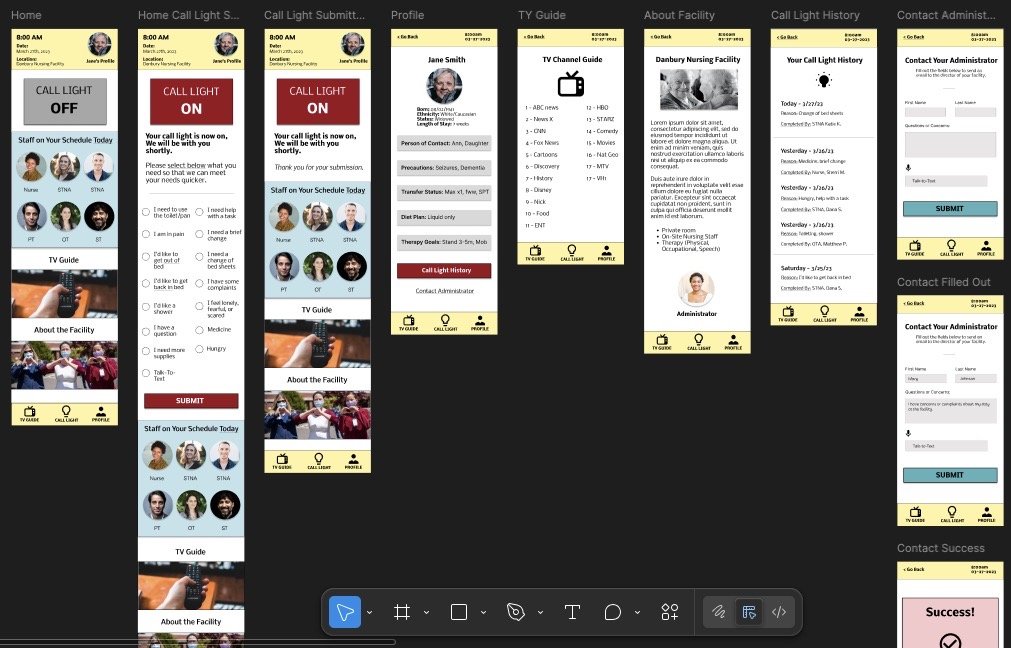
High Fidelity Wireframes
Using the findings from testing, I refined the interface in Figma with color, typography, imagery, and iconography. Additional testing helped identify opportunities to improve accessibility, navigation, and overall usability before moving toward the final prototype.
05 – High-Fidelity Design
06 – Responsive Design
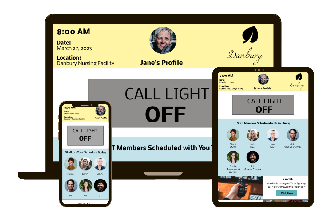
Responsive Designs
Because the Call Light system could be accessed across different devices and environments, I created responsive designs for mobile, tablet, and desktop experiences. This allowed the interface to adapt to different screen sizes while maintaining consistent navigation and functionality.
Key Takeaways
This project reinforced the importance of designing around real user needs rather than assumptions. Speaking with residents and employees helped me understand the problem from multiple perspectives and consider how the experience needed to work for both users and staff.
The project also strengthened my ability to move from an initial problem through research, ideation, testing, and iteration to a responsive prototype. Most importantly, it reinforced the value of listening to users and allowing their needs to guide design decisions.