Sustain-A-LookA clothing company focused on reducing environmental waste and supporting ethical labor practices through eco-friendly, fair-trade clothing.
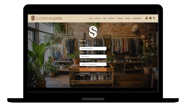
Overview
Sustain-A-Look is a clothing company focused on reducing environmental waste and supporting ethical labor practices through eco-friendly, fair-trade clothing.
For this project, Sustain-A-Look specifically needed two new webpages, optimization of the navigation based on those two new pages, streamlined copy for three other webpages, and accessibility improved regarding the color contrast, readability and legibility. They requested a seamless, accessible purchasing experience with design consistency across the website.
Various areas were found that needed to be changed such as the space, cognitive overload, insufficient information architecture, inconsistency in brand identity, navigational issues, and lack of accessibility.
My Role
I evaluated and redesigned Sustain-A-Look’s website to improve navigation, information architecture, accessibility, and the overall e-commerce experience. My work included user testing, journey mapping, content organization, UX evaluation, wireframing, UI design, and prototyping.
Tools: Adobe XD
Focus: UX Research • User Testing • Information Architecture • Accessibility • UI Design • E-commerce
01 – User Testing & Journey Mapping
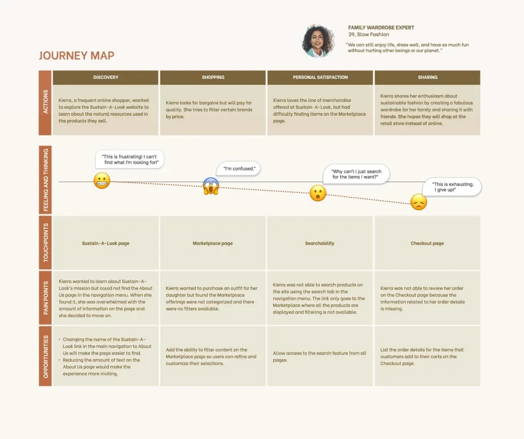
User Journey Map
After reviewing user testing and feedback provided for the project, I identified several areas where users experienced difficulty, including navigating between the Marketplace and Checkout pages, searching and filtering products, and reading certain content.
A user journey map helped to better understand these frustrations and identify opportunities to improve the overall shopping experience. The research also highlighted issues with information overload, navigation, information architecture, and accessibility.
02 – UX Evaluation & Information Architecture
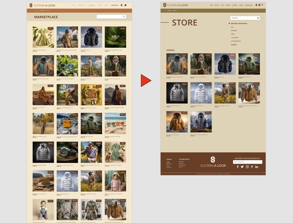
Store Page Before and After
Based on the research findings, I identified opportunities to improve the site’s information architecture, navigation, and overall shopping experience.
The existing Store page presented users with a large amount of information and limited ways to narrow their choices. I reorganized products into categories with search and filtering functionality, allowing users to more efficiently find products.
I also improved navigation between the Marketplace and Checkout experience and added a way for users to review their order before completing their purchase.
03 – Website Redesign & Accessibility
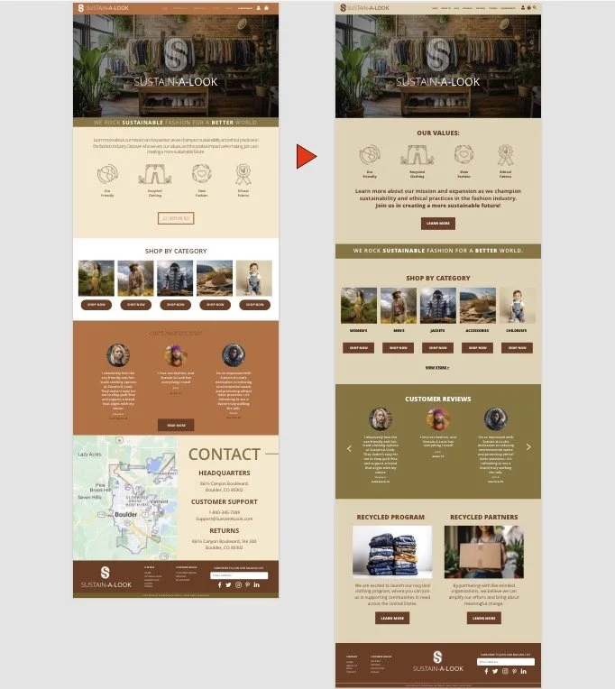
Home Page Before and After
I redesigned key pages in Adobe XD, focusing on clearer information hierarchy, consistent branding, improved navigation, and a more accessible visual experience.
The Home page was reorganized to reduce cognitive overload and make important content easier to find. I also incorporated the company’s two new pages, Recycled Program and Recycled Partners, into the overall site structure.
Color choices were reviewed using contrast-checking tools to improve readability across body copy, headings, navigation, footers, and call to actions.
04 – Product & Checkout Experience
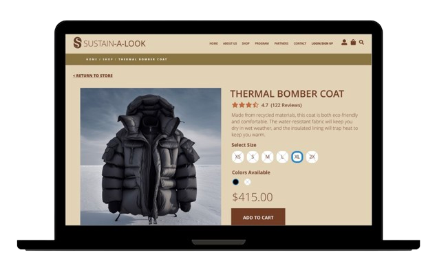
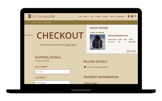
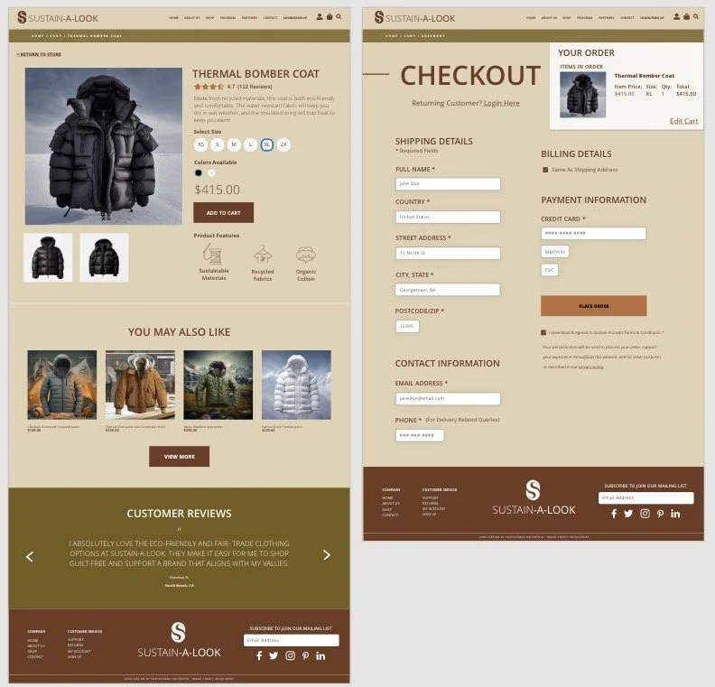
I redesigned the product selection and checkout experience to address the usability issues identified during testing.
The updated Marketplace provides clearer product organization, search and filtering options, while the Checkout experience allows users to navigate back to the Marketplace and review their order before completing the purchase.
The goal was to create a simpler, more intuitive shopping experience while maintaining visual consistency throughout the site.
Key Takeaways
This project reinforced the importance of information architecture and accessibility in creating effective digital experiences.
The usability findings highlighted opportunities to improve product discovery, navigation, and accessibility. I used those insights to reorganize content, improve navigation, refine the visual system, and introduce search and filtering to create a more focused and accessible e-commerce experience.
The project strengthened my ability to evaluate an existing digital experience, identify opportunities for improvement, and translate research findings into practical design decisions.